YAY!
It's finally completed!
Here are the best shots from my editorial shoot. Even though there was a bit of stress, I am so pleased with the final outcome and it was exactly as I hoped!
Take a look...
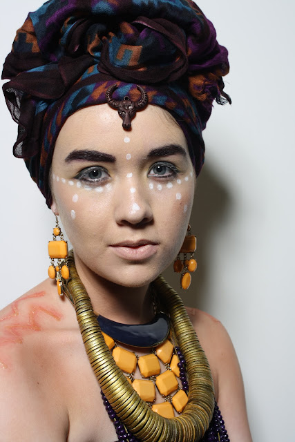
I love the contrasts on both the black and white background, but I have to say I think the white backdrop is my favourite! It really makes the image stand out strongly and draws attention to everyone aspect of the model. The accessories stand out beautifully, and the head piece is bold up against the background. I think its a much kinder background, and personally I think that it compliments the makeup better because white dots on the models cheeks become a lot more vibrant, but also help the whole image blend together.
I am so pleased with the outcome of this shoot. As you can see though there were a few changes. Such as, I got rid rid of the black line down the chin because it made the makeup look too harsh and mish-mashed. I also changed the lip colour from being dark to pale because the attention of the image wasnt all over the place. With the dark lips it seemed much too over crowded, in my opinion.


No comments:
Post a Comment